General Information
| Completion: | 7 November 2008 |
|---|---|
| Status: | in use |
Project Type
| Function / usage: |
Bicycle and pedestrian bridge |
|---|---|
| Structure: |
Through truss bridge |
| Material: |
Steel bridge |
| Structure: |
Covered bridge |
Location
Technical Information
Dimensions
| span | 50 m |
Materials
| roof |
wood
|
|---|---|
| truss |
steel
|
This is Not Only A Bridge
A bent path over the water
On December 2004, we were commissioned the design of a pedestrian bridge in the Plot-18 of Qingpu District, Shanghai. The bridge would connect the two sides of the Dianpu canal, separated 50m, and thus linking Hebin road on the north bank, with a new housing development on the south bank. Next to the bridge, inside the new development area, the new master plan defines the location of a catholic church, later designed by the Spanish office Sancho-Madridejos. The strategy of interpreting the physical variables of the site and local historical references, together with the objective of expressing and optimizing the structural performance of the bridge, will generate the final form of the project.
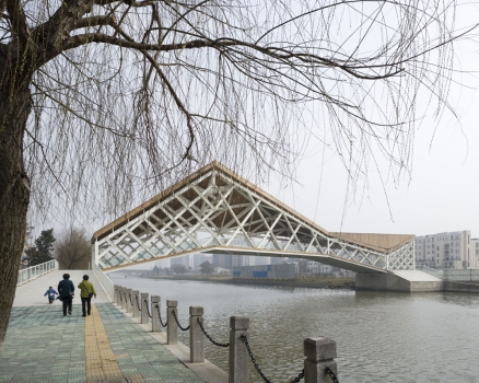
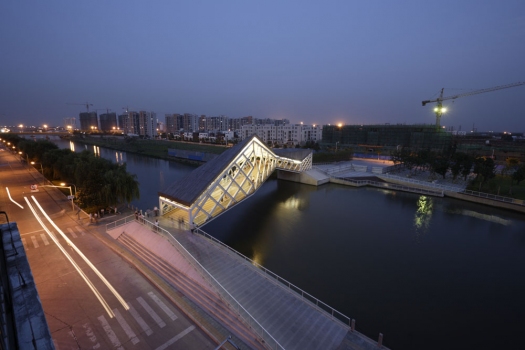
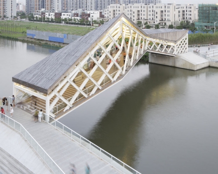
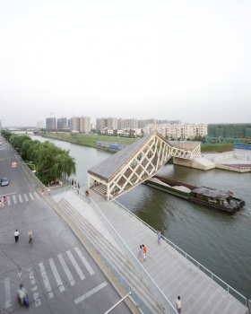
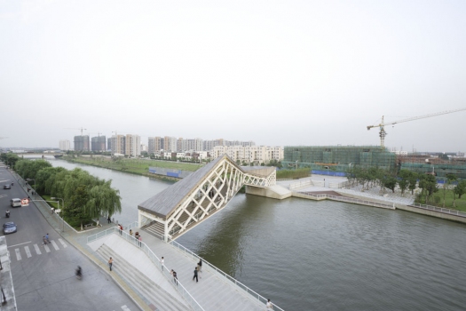
Learning from the wonderful bridges of the great water town of Zhujiajiao, very near Qingpu, or those from the exquisite gardens in Suzhou, we decided to link both sides of the canal with a bent path, indirectly, instead of using a common direct line. The winding axis integrates the different flows of access and visually emphasizes the surroundings. To the north, one landing direction is aligned with Pucan road. To the south, the other end is pointing to the entrance of the public square in front of the church. Both axes extend from each bank 12.5m over the waters, and a middle sector of 25m connects them. Since the central part of the bridge is facing the church, users will have a privileged vantage point of the building from the bridge. This perceptual relation creates a very strong spatial tension between the two structures, which activates the public area in between.
The load-span ratio recommends the use of the metal truss as structural model. In order to resist the strong torsion stresses associated with the support-less zigzagging shape of the bridge, we need to structurally activate all the planes of its distorted volume. Together, the vertical and the horizontal surfaces of the bridge behave like a three-dimensional beam, working as a whole, like a tube that is deformed along the direction of its axis.
Both shores of the river have contrasting character. At the north bank, the bridge lands perpendicularly to a narrow and busy street. At the south bank, the public space is wide and quiet, free of vehicles. This situation is underlined via the design of an asymmetric system of structural constraints. The bridge has a simple support on the transversal ramp that faces the northern access. On the contrary, there is a rigid connection with the longitudinal ramp that welcomes the bridge towards the large southern square. Conceived initially in stone, both ramps are finally built with reinforced concrete. Although they belong conceptually to the ground, their relation is again, different. The northern ramp seems to be lying over the stone riverside, while the southern ramp advances towards the river, breaking and altering the layout of the bank, from which it emerges energetically.
Structural performance determines formal expression
Because of these very different supports, the resulting diagram of bending momentum of the overall structure is therefore asymmetric. This condition is translated to the design of the bridge’s elevation, so the distance between the upper and lower profiles varies according to the structural requirements. Therefore, users walk inside the bridge through a sequence of spaces that contract and expand, emphasizing even more the alternating movement of the structure.
After the general profile and structure has been defined, we continue optimizing the amount of different steel sections needed for the construction of the bridge. Thus, we can lower the cost and ease the manufacturing of the beam. Following this general strategy, the design of the bars that form each surface expresses the results of another important structural analysis: the diagram of shear stress. Instead of using a regular pattern whose bars increase their section as the stress is higher, we prefer to make the pattern denser, and still use the same structural section. This method is very common in structures we can find in nature. Also, it is the same concept used in the structural design of the CCTV building in Beijing. However, this solution has a long tradition in structural design, which we can trace back to the iron bridges of the XIXth century, for example.
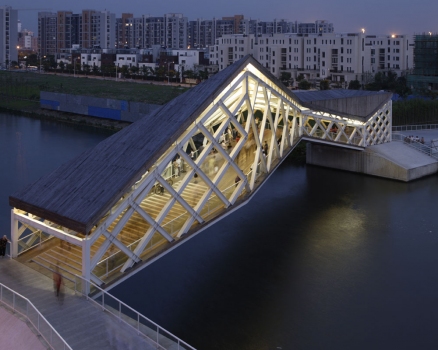
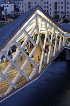
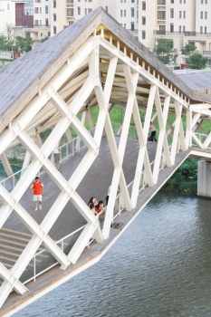
What is most important in our case is the rhythm of the geometric pattern on the elevation, made of rhomboids. The cells are shifted one half the largest module, offset the folding lines, so the geometrical rhythm can doubled seemingly. This evolution is most evident at the longest fold of the bridge, 9m, which doesn’t need the structural contribution of a vertical bar, and where the transition nodes can be observed most clearly.
Besides some square tubes that we had to use in the critical locations of the structure, most of the steel components are “open” structural profiles, H-type section. After painted white, the open profiles of the structure will cast self-shadows that would make visitors to perceive the width of the bars thinner. Slimmer proportions will virtually alleviate the weight of the bridge, even if only perceptually, and will contribute to the final effect of “lightness” and “magic equilibrium” of our twisting, jumping structure.
A room over the canal
It is very common in Chinese tradition of bridge construction, especially in Southern China, to find cases. normally made in wood, where the structures become a certain type of complete buildings that are hovering over the rivers. Indeed, we also understand that our bridge should provide for a dedicated space over the canal, becoming a room over the water, more than merely acting as an engineering device that solves a problem of physical connectivity.
Originally, we planned to envelope both the roof and deck with wooden skins. But after seeing the metal primary structure finished, its delicate craftsmanship and general beauty, we opted for leaving the steel exposed and then lift the wood covers above the steel beams. The wood we chose is heat-treated pine. Compared with other methods for protecting wood, heat treatment is more environmentally conscious since it doesn’t apply metal components. Moreover, the exposure of the wood only to temperature preserves the original brown color of the material, controlled by the length of exposure, and thus avoids undesired blue-green hues. The orientation of the wooden sticks follows the direction of maximum slope within each surface, in order to achieve the rapid drainage of rainwater, which pours directly over the river. The concave area of the wood cover next to the southern entrance needed a special detail. Taking the artworks of the Italian artist Lucio Fontana as inspiration, the wooden surface is cut, sharply, and water is drained out through the “wound”.
The relation of the bridge with the different lighting conditions is one of the most important characteristics of the project. During the day, the inner surfaces of wood will screen the glittering rays of the sun reflected from the waters of the canal. At night, the sloped ceiling serves as a large diffuser for the artificial lighting that is embedded onto the structure. A double, sometimes triple, line of low-power fluorescent lamps is built over the diagonal beam that crosses the entire bridge. We use the space between the primary structure and the wood ceiling to disperse a cloud of indirect light.
The design of the lighting in this way will obviously render a very different image of the bridge during the day or at night. This effect is intentional. In general terms, we believe that trying to reproduce with artificial light the same visual conditions as with the sunshine, besides being impossible, is not as interesting as giving the construction a new appearance after the sunset, where we can underline other formal and spatial aspects of the project.
Under the sun, the most important feature of our bridge is the vertical surfaces, the elevation of the strong metal tracery, the play of self shadows within the structure, and shadows that the structure casts inside the bridge, over the deck’s wooden floor, duplicating the geometric container. Under the moon, the attention is directed towards the wooden ceiling, which is in permanent shade during the day. The ambient light created by all multiple reflections will transform the bridge into a large lamp over the water.
Participants
Relevant Web Sites
Relevant Publications
- (2014): "Footbridging" China. Challenging tradition in recent footbridge projects. Presented at: Footbridge 2014 - Past, Present & Future, London, 16-18 July 2014.
- About this
data sheet - Structure-ID
20071115 - Published on:
15/04/2016 - Last updated on:
15/01/2018

