General Information
Project Type
| Function / usage: |
Library |
|---|---|
| Architectural style: |
Modern |
| Material: |
interior structure: Concrete structure exterior walls: Masonry structure |
Location
| Location: |
Exeter, Rockingham County, New Hampshire, USA |
|---|---|
| Address: | 21 Elm Street |
| Coordinates: | 42° 58' 43.71" N 70° 56' 58.16" W |
Technical Information
Dimensions
| width | 33 m | |
| height | 24 m | |
| length | 33 m |
Materials
| interior structure |
reinforced concrete
|
|---|---|
| exterior walls |
brick
|
Excerpt from Wikipedia
Phillips Exeter Academy Library is a library that serves Phillips Exeter Academy, an independent boarding school located in Exeter, New Hampshire. It is the largest secondary school library in the world, containing 160,000 volumes over nine levels with a shelf capacity of 250,000 volumes.
When it became clear in the 1950s that the library had outgrown its existing building, the school initially hired an architect who proposed a traditional design for the new building. Deciding instead to construct a library with a contemporary design, the school gave the commission to Louis Kahn in 1965. The library opened in 1971. In 1997 the library received the Twenty-five Year Award from the American Institute of Architects, an award that recognizes architecture of enduring significance that is given to no more than one building per year.
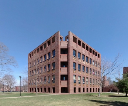
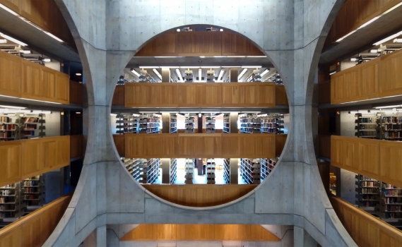
Kahn structured the library in three concentric square rings. The outer ring, which is built of load-bearing brick, includes all four exterior walls and the library carrel desks immediately inside them. The middle ring, which is built of reinforced concrete, holds the heavy book stacks. The inner ring is a dramatic atrium with enormous circular openings in its walls that reveal several floors of book stacks.
History and services
The first library at Phillips Exeter Academy was a single small room. A member of the class of 1833 remembered it as containing "old sermons and some history, scarcely ever read". Even as late as 1905 the library had only two rooms and 2,000 volumes.
In 1912 the Davis Library was added to the campus with space for 5,000 volumes. Although a major improvement, its atmosphere was inhospitable by the standards of later generations. Stacks were locked to students, for example, and the librarian's office was located at the entrance to the stacks to maximize control over entry. Decisions about book selections and the library's program were in the hands of an all-male faculty committee instead of the female librarian.
In 1950 Rodney Armstrong became librarian, the first with a graduate degree in library science. One of his first moves was to open the stacks to students. That solved one problem, but the real difficulty was the lack of space. The library contained 35,000 volumes at that point, many of them stored in cardboard boxes for lack of shelf room. After years of effort, Armstrong eventually succeeded in bringing a new library to the academy.
Architect Louis Kahn was chosen to design the new library in 1965, and it was ready for occupancy in 1971. Architectural historian Vincent Scully acknowledged its architectural significance by using a photo of it as the frontispiece for his book Modern Architecture and Other Essays.
On November 16, 1971, classes were suspended for a day, and students, faculty, and staff moved books (the library had 60,000 volumes by this time) from the old Davis Library into the new library.
Henry Bedford, who became librarian shortly after the new library was occupied, supervised the transition not only to the new building but also to a new way of operating a library. Staff librarians were encouraged to see themselves as co-instructors with the regular faculty and to put less emphasis on shushing library patrons. A piano was installed and the library began sponsoring lectures and concerts.
In 1977 Jacquelyn Thomas became the first librarian with full faculty status. By 2006 she oversaw a staff of seven, all with graduate degrees in library science. During Thomas' tenure the library's collection and programming grew to a size appropriate to a small liberal arts college. Today the library houses 160,000 volumes on nine levels and has a shelf capacity of 250,000 volumes, making it the largest secondary school library in the world. The library also contains a collection of works by alumni as well as the Academy Archives.
The library was the first building on campus to be computerized thanks to the foresight of Armstrong and Kahn, who supplied the library with sufficient conduit space for the cabling needed by the coming computer revolution.
In 1995, the library was officially named the Class of 1945 Library, honoring Dr. Lewis Perry, Exeter's eighth principal, who served from 1914 to 1946.
Choosing Louis Kahn as architect
The project to build a new and larger library began in 1950 and progressed slowly for several years. By the mid-1960s, O'Connor & Kilham, the architectural firm that had designed libraries for Barnard, Amherst and West Point, had been chosen to design the new library and had drafted plans with traditional architecture. Richard Day arrived as the new principal of the academy at that point, however, and found their design to be unsatisfactory. He dismissed them, declaring his intention to hire "the very best contemporary architect in the world to design our library".
The school's building committee was tasked with finding a new architect. Influential members of the committee became interested in Louis Kahn at an early stage, but they interviewed several other prominent architects as well, including Paul Rudolph, I. M. Pei, Philip Johnson and Edward Larrabee Barnes. Kahn's prospects received a boost when Jonas Salk, whose son had attended Exeter, called Armstrong and invited him to visit the Salk Institute in California, which Kahn had recently built to widespread acclaim. Kahn was awarded the commission for the library in November 1965.
Kahn had already thought deeply about the proper design for a library, having earlier submitted proposals for a new library at Washington University. He also expressed a deep reverence for books, saying, "A book is tremendously important. Nobody ever paid the price of a book, they only paid for the printing". Describing the book as an offering, Kahn said, "How precious a book is in light of the offering, in light of the one who has the privilege of the offering. The library tells you of this offering".
The building committee carefully considered what they wanted in a new library and presented their ideas to Kahn in an unusually detailed document that went through more than fifty drafts. The early designs included some items that were eventually rejected, such as a roof garden and two exterior towers with stairs that were open to the weather. They were removed from the plans when the building committee reminded Kahn that neither of those features would be practical in New England winters.
Architecture
The library has an almost cubical shape: each of its four sides is 111 feet (33 m) wide and 80 feet (24 m) tall. It is constructed in three concentric areas (which Kahn called "doughnuts"). In the words of Robert McCarter, author of Louis I. Kahn, "From the very beginning of the design process, Kahn conceived of the three types of spaces as if they were three buildings constructed of different materials and of different scales – buildings-within-buildings". The outer area, which houses the reading carrels, is made of brick. The middle area, which contains the heavy book stacks, is made of reinforced concrete. The inner area is an atrium.
The library's heating and cooling needs are supplied by the nearby dining hall, which Kahn built at the same time as the library, but which is considered to be of less architectural significance.
Exterior
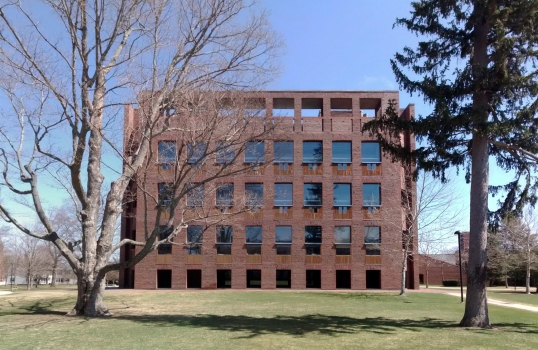
The building committee's document specified that the new library should be "unpretentious, though in a handsome, inviting contemporary style". Kahn accordingly made the building's exterior relatively undramatic, suitable for a small New England town. Its facade is primarily brick with teak wood panels at most windows marking the location of a pair of wooden carrels. The bricks are load-bearing; that is, the weight of the outer portion of the building is carried by the bricks themselves, not by a hidden steel frame. Kahn calls this fact to the viewer's attention by making the brick piers noticeably thicker at the bottom where they have more weight to bear. The windows are correspondingly wider toward the top where the piers are thinner. Kahn said, "The weight of the brick makes it dance like a fairy above and groan below."
The corners of the building are chamfered (cut off), allowing the viewers to see the outer parts of the building's structure, the outer "doughnut." The Macmillan Encyclopedia of Architects says, "Kahn sometimes perceived a building as enclosed by 'plate-walls,' and to give emphasis to this structural form, he interrupted the plates at the corner, leaving a gap between them. The Library at Phillips Exeter Academy in Exeter, New Hampshire (1967–1972) is a classic example". Each of these four brick "plate-walls," which house the library carrels, is 16 feet (4.9 m) deep.
At the top of the exterior walls is a row of openings similar to the windows below except that these openings are above the roof and have no glass. Vincent Scully said that Kahn was drawn to architecture based on "solid, almost primitive, masonry masses with voids in them without glass." The bottoms of these window-like openings are 6 feet (1.8 m) above the floor of an arcade that follows the perimeter of the top of building.
Another arcade circles the building on the ground floor. Kahn disliked the idea of a building that was dominated by its entrance, so he concealed the main entrance to the library behind this arcade. His original design, however, called for landscaping with a paved forecourt that would have indicated the entrance without disrupting the symmetry of the facade. Architectural historian William Jordy said, "Perverse as the hidden entrance may seem, it emphatically reinforces Kahn's statement that his design begins on the periphery with the circle of individual carrels, each with its separate window."
Interior
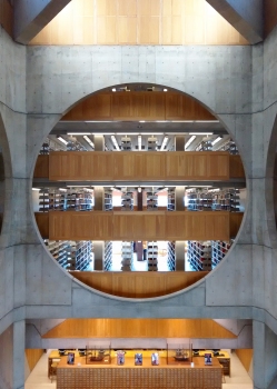
A circular double staircase built from concrete and faced with travertine greets the visitor upon entry into the library. At the top of the stairs, the visitor enters a dramatic central hall with enormous circular openings that reveal several floors of book stacks. At the top of the atrium, two massive concrete cross beams diffuse the light entering from the clerestory windows.
Carter Wiseman, author of Louis Kahn: Beyond Time and Style, said, "The many comparisons of the experience of entering Exeter's main space to that of entering a cathedral are not accidental. Kahn clearly wanted the students to be humbled by the sense of arrival, and he succeeded." David Rineheart, who worked as an architect for Kahn, said, "for Lou, every building was a temple. Salk was a temple for science. Dhaka was a temple for government. Exeter was a temple for learning."
Because the stacks are visible from the floor of the central hall, the layout of the library is clear to the visitor at a glance, which was one of the goals the academy's building committee had set for Kahn.
The central room is 52 feet (15.8 m) high, as measured from the floor to the beginning of the roof structure, and 32 feet (9.8 m) wide. Those dimensions approximate a ratio known as the golden ratio, which was studied by the ancient Greeks and has been considered the ideal architectural ratio for centuries.
The circle and the square that are combined so dramatically in the atrium were considered to be the paradigmatic geometric units by the ancient Roman architect Vitruvius. He also noted that the human body is proportioned so that it can fit in both shapes, a concept that was famously expressed with a combined circle and square by Leonardo da Vinci in his drawing Vitruvian Man. The topic was repeatedly raised by Kahn in several projects.
The outer part of the building, which houses the carrels, is built of load-bearing brick. Each carrel floor spans two levels of book stacks.
The specifications of the academy's building committee called for a large number of carrels (the library has 210) and for the carrels to be placed near windows so they could receive natural light. The latter point matched Kahn's personal inclinations exactly because he himself strongly preferred natural light: "He is also known to have worked by a window, refusing to switch on an electric light even on the darkest of days." Each pair of carrels has a large window above, and each individual carrel has a small window at desk height with a sliding panel for adjusting the light.
The placement of carrel spaces at the periphery was the product of thinking that began years earlier when Kahn submitted proposals for a new library at Washington University. There he dispensed with the traditional arrangement of completely separate library spaces for books and readers, usually with book stacks on the periphery of the library and reading rooms toward the center. Instead, he felt that reading spaces should be near the books and also to natural light. For Kahn, the essence of a library was the act of taking a book from a shelf and walking a few steps to a window for a closer look: "A man with a book goes to the light. A library begins that way. He will not go fifty feet away to an electric light." Each carrel area is associated with two levels of book stacks, with the upper level structured as a mezzanine that overlooks the carrels. The book stacks also look out into the atrium.
The inherent massiveness of the brick "plate-wall" structure of the outer part of the library helps to create the cloistered atmosphere that Kahn felt was appropriate for library carrels. While explaining his proposal for the library at Washington University, Kahn had used the example of the cloistered carrels at the monastic library at Dunham, England, to explain his "desire to find a space construction system in which the carrels were inherent in the support which harbored them ... Wall-bearing masonry construction with its niches and vaults has the appealing structural order to provide naturally such spaces.",70
Architectural interpretations
Architectural experts sometimes differ in their interpretations of Kahn's design. For example, in reasoning why the cross beams at the clerestory windows above the atrium are so massive, Carter Wiseman says, "While they appear to be—and indeed are—structural, they are far deeper than necessary; their no-less-important role was to diffuse the sunlight coming in from the surrounding clerestory windows and reflect it down into the atrium." Sarah Goldhagen thinks there is more to the story, asserting that "the concrete X-shaped cross below the skylit ceiling at the Exeter Library is grossly exaggerated for dramatic effect." Kathleen James-Chakraborty goes even further: "Above, in the most sublime gesture of all, floats a concrete cross brace, illuminated by clerestory windows. Its weight, which appears ready to come crashing down upon the onlooker, revives the sense of threat dissipated elsewhere by the reassuring familiarity of the brick skin and wood details." Kahn similarly floated a massive concrete structure above the sanctuary of the First Unitarian Church of Rochester, which he designed a few years earlier. The library is also often discussed in comparison with contemporary sacred buildings. The plans have some characteristics of Vasrtu Purusha Mandala as well as other symbolic forms that allow various symbolic interpretations.
Another issue is the extent to which Kahn deliberately introduced elements into some of his buildings that give them the ageless atmosphere of ruins. Kahn himself spoke of "wrapping ruins around buildings", although in the context of another project. In his essay "Louis I. Kahn and the Ruins of Rome", Vincent Scully argues that Kahn followed this practice in several of his buildings, including this library, saying, "And in his library at Phillips Exeter Academy in New Hampshire, Kahn won't even let it become a building; he wants it to remain a ruin. The walls don't connect at the top. They remain like a hollow shell". Romaldo Giurgola, on the other hand, avoids this interpretation in the entry he wrote for Louis Kahn in the Macmillan Encyclopedia of Architects. In it, while discussing the arrangement of exterior components of Kahn's National Assembly Building of Bangladesh, Giurgola wrote, "This relationship with daylight was the determining element behind this solution, rather than the formal desire to 'create ruins,' as some critics have suggested." In the very next paragraph, Guirgola describes the chamfered corners of the library by saying only that Kahn used this device to show that the structural importance of the corner is greatly reduced in buildings like the Exeter Library that are constructed with reinforced concrete and other modern materials.
Text imported from Wikipedia article "Phillips Exeter Academy Library" and modified on October 7, 2019 according to the CC-BY-SA 4.0 International license.
Participants
- Louis Isadore Kahn (architect)
Relevant Web Sites
- About this
data sheet - Structure-ID
20078466 - Published on:
04/10/2019 - Last updated on:
05/10/2019

