General Information
| Completion: | 4 December 2012 |
|---|---|
| Status: | in use |
Project Type
| Function / usage: |
Museum building |
|---|
Awards and Distinctions
| 2015 |
entry
for registered users |
|---|
Location
| Location: |
Lens, Pas-de-Calais (62), Hauts-de-France, France |
|---|---|
| Coordinates: | 50° 25' 50.43" N 2° 48' 16.24" E |
Technical Information
Dimensions
| Entrance hall | ||
|---|---|---|
| roof | width | 56 m |
| length | 65 m | |
New Louvre-Lens Museum
1. Introduction
In 2005, Japanese architects Kazuyo Sejima and Ruye Nishizawa (SANAA) from Tokyo, together with Bollinger + Grohmann as specialist planners for the structural and facade design, won the internationally announced competition. The unusual design of the filigree, flat structure with its slightly curved building envelope was to place the highest demands on the execution of the details. Furthermore, the implementation of this reduced architectural language was to meet further challenges against the backdrop of the Energy Saving Ordinance based on the EU Building Directive (Régulation Thermique 2005 ), which was made mandatory in the same year, and the sustainability certification (HQE – Haute Qualité Environnementale), which has been mandatory for all public buildings since the 90s.
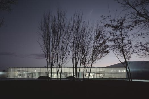
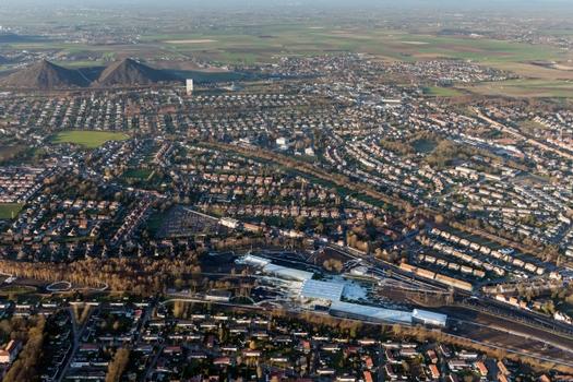
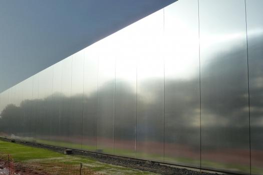
Already in the competition design, the characteristic features of the future building stood out clearly. A composition of five long flat structures staggered over a length of 360 meters into the depth of a 20-hectare renaturalized area of a former coal mine. At the center is a glazed entrance building, around which are grouped two opaque exhibition halls, an auditorium, and a glass pavilion, whose diffusely reflective facades seem to visually merge with the surrounding landscape.
2. Entrance Hall
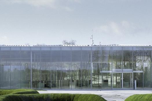
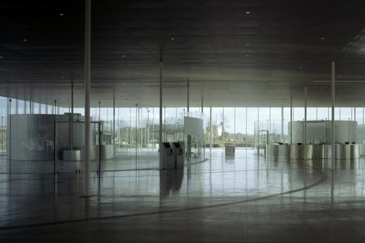
The interaction of the roof structure, the supporting structure and a highly filigree glass façade proved to be very complex in the design of the 4,000 m² entrance hall. Still proposed as a fully glazed structure in the competition design, the above-mentioned requirements resulted in a revision of the roof to an insulated structure with a few skylights, executed as a simple girder grid structure. The 65 x 56 roof rests on slender steel columns. The columns on a grid of 9 x 9 meters have a diameter of only 140 mm and a wall thickness of 14 mm at a height of 6 meters. Undoubtedly, these cannot stiffen the entire structure. Nor does it have any other bracing wall plates or other vertical components for absorbing and transferring horizontal loads. Only the connection points between the hall and the galleries are used for bracing. Here, a highly complex junction point has been created, which necessitated the cooperation of the various trades. Among other things, the entire roof area is drained here, and ventilation pipes also had to be accommodated. For the connection of the 6-meter-high fiberglass elements with their slim substructure to the cantilevered roof edge, a low-constraint design was ultimately used, which allows each individual pane of glass to be freely rotated at the base.
As already mentioned, the energy standard of the French sustainability label HQE was required for all building structures from the outset. This required insulating glass units with a Ug value in the center of the glass of 1.1 W/m²K for the facades of the entrance hall and the glass pavilion that closes off the ensemble to the east. This would have necessitated an additional thermal insulation coating and gas filling of the space between the panes, which would have had consequences for the originally planned height of the building of 7.50 meters, since at that time the maximum size in the industrial production of architectural glass was 6 meters. Despite intensive cooperation with a number of European glass manufacturers who would have made it possible to produce insulating glass panes of the required size, the client finally reduced the dimensions to 6 meters shortly before the invitation to tender. For the substructure of the façade, a steel sword with dimensions of 120 x 30 mm clad with polished aluminum sheet was used. In addition to its lower manufacturing costs, the post depth of 150 mm was also an advantage. Thus, the swords are only half as deep as the originally planned glass swords.
3. Exhibition halls
For both structures, with a width of 25 to 26 meters and a length of up to 120 meters, freedom from columns and variable, controllable use of daylight via the roof were the main planning requirements from the outset. In addition, the height of the roof structure was to be as low as possible and the roof pitch was to be equally low. In the preliminary design phase, the roof structure was still conceived as an under-span girder and the roof was planned as a fully glazed area. This would have required triple glazing for winter thermal protection and exterior solar shading. The profile systems required for a low roof pitch also proved to be problematic, since in France a roof pitch of at least two degrees is required by building regulations. Thus, the structural engineers developed further variant details, always under the premise of a structure that was as minimalist as possible. In the meantime, the lighting designer had been able to prove that the necessary daylight comfort could already be achieved with sixty percent glazing. So the focus was on detailing this variant.
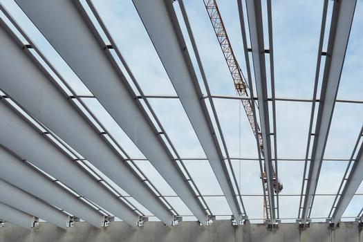
The result consists of a regular sequence of 90-cm-wide panels that emphasize the linearity of the roof structure. The newly developed girders with a span of 26 meters are T-sections made of flat steel, 60 to 110 cm high, with a web thickness of only 12 mm, the 25 mm wide flange is hidden in the insulation panels between the glasses. The overall structural system could only be realized by making the secondary structure that supports the glass panels part of the primary structure, thus preventing lateral deflection of the girder top chords.
For conservation reasons, despite the daylight concept, it should be possible to regulate the amount of natural light in order to protect the artworks from direct sunlight. In addition, the client expected the possibility of controllable darkening. The decision was made to use an external shading system made of gratings whose bars are specially inclined and can be opened for cleaning purposes. Motorized slats are mounted on the underside for darkening. This made it possible to integrate an extremely flexible daylighting system into a roof structure of less than 30 cm.
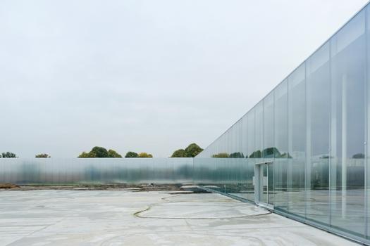
The facades are clad with anodized aluminum panels, the same size as the glass units of the entrance building. A special requirement in terms of material research and sampling was the slightly curved and diffusely reflective surface with minimal vertical butt joints. The individual panels were finally produced as sandwich elements and mounted in front of the insulation using an agraff system, in this way no fasteners are visible.
The modest character of the winning design is reduced to the glass skin and the aluminum surfaces, which merge into an amorphous unit, thus giving the artworks a simple but dignified frame. It proved to be a particular challenge to translate the minimalist architecture into a quasi-invisible construction and to support the weightless character of the structure with the most filigree dimensions possible.
Explanatory report by Bollinger + Grohmann Ingenieure on the submission to the Ulrich Finsterwalder Ingenieurbaupreis 2015.
Participants
Relevant Web Sites
There currently are no relevant websites listed.
Relevant Publications
- (2014): Einfachheit und Komplexität - Louvre Lens. In: (2014): Ingenieurbaukunst 2015. Ernst & Sohn, Berlin (Germany), ISBN 9783433030967, pp. 44-51.
- (2014): Louvre Lens - Einfachheit und Komplexität. In: Stahlbau, v. 83 (April 2014), pp. 17-27.
- About this
data sheet - Structure-ID
20030753 - Published on:
30/08/2007 - Last updated on:
17/05/2015

